A dashboard can make a business owner feel informed and lost at the same time. A real estate agent sees a 47% tour bounce rate and can't tell whether that means the listing is weak, the audience is wrong, or the page is doing fine for its market. A hotel marketer sees a 1.2% booking-page conversion rate and still doesn't know if the number is healthy, because a number by itself never explains what good looks like.
That is where industry benchmark data changes the conversation. It turns raw performance into a comparison, and comparison into a decision. Instead of asking, “What is this number?”, the better question becomes, “What is this number relative to?” For operators who manage listings, tours, bookings, inquiries, or leads, that shift is the difference between guessing and managing.
Benchmarking works best when the reader treats it like a measurement system, not a buzzword. The rest of this guide keeps that practical lens in place, with one goal, helping a business owner look at any KPI and decide whether to keep it, fix it, or ignore it.
Table of Contents
- Why Most Business Numbers Are Meaningless Without Context
- What Industry Benchmark Data Means
- How Benchmark Datasets Are Built and Validated
- Benchmark Examples Across Four Sectors
- Turning Your Virtual Tour Analytics into Benchmarks
- When Published Benchmarks Are the Wrong Comparison
- Reliable Sources and a Benchmarking Project Checklist
Why Most Business Numbers Are Meaningless Without Context
Raw metrics feel decisive until they're placed beside a peer group. A school can celebrate 200 virtual tour views and still struggle to generate applications, while a brokerage can generate plenty of clicks and still fail to move prospects into action. The number may be accurate, but it's not informative yet.
That's the common trap in dashboards. Teams collect views, bounce rates, leads, and conversion events, then try to read them like standalone facts. Without a comparison group, those figures can't tell whether the business is underperforming, overperforming, or just operating in a segment with different behavior patterns.
The missing frame around every metric
Industry benchmark data adds that missing frame. It answers the question, “Normal compared with what?” In practice, that means a metric gets tied to a peer group, a time basis, and a summary value, usually a median or mean, that stands in for what typical performance looks like in that group.
That matters for daily decisions. A marketer deciding whether to rewrite a landing page, a hotel team deciding whether to push more traffic to the booking engine, or an admissions office deciding whether to revise a virtual open day flow all need the same thing, a reference point. A metric without context is just a measurement. A benchmark turns it into a verdict.
Practical rule: if a dashboard number can't be compared to a defined peer group, it should be treated as a signal, not a conclusion.
This is why conversion analysis is so often the first place business owners feel the pain. A funnel can look busy while failing at the bottom, and a clean-looking top of funnel can hide a weak close rate. A useful starting point for that thinking is a conversion funnel analysis guide, because it shows how raw traffic becomes a sequence of decisions rather than a pile of events.
The rest of the benchmarking conversation starts there. Not with a perfect number, but with the discipline of asking what the number should be measured against.
What Industry Benchmark Data Means
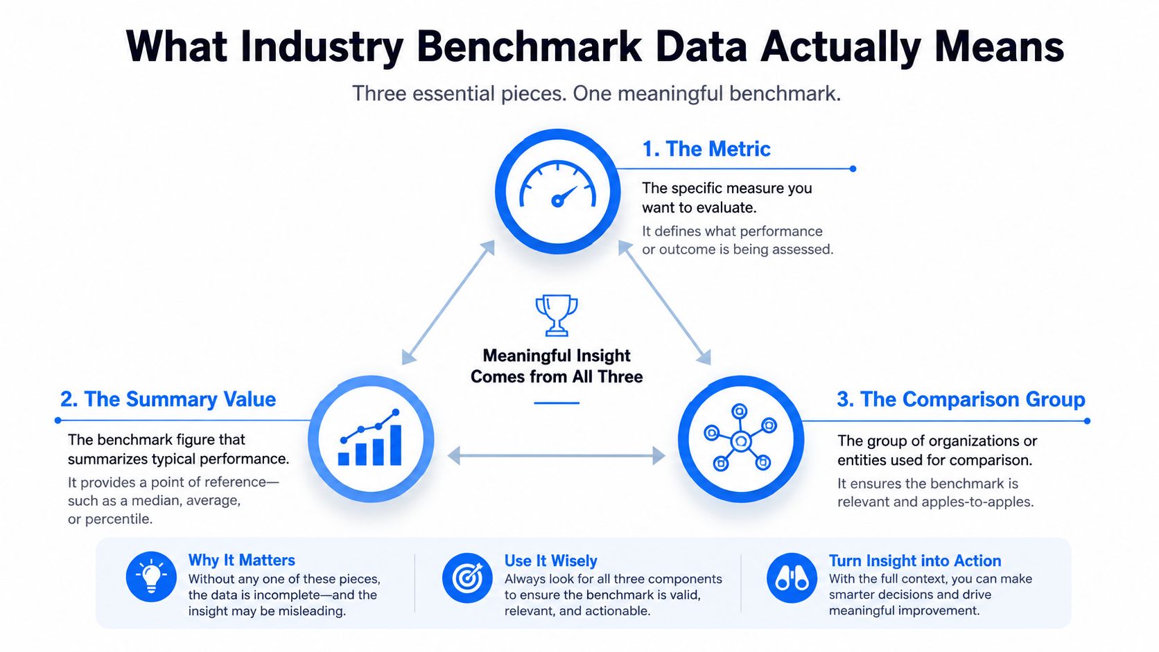
A useful starting definition is simple. Industry benchmark data is a standardized comparison framework. It only works when three parts are defined together, the metric, the summary value that stands in for normal performance, and the comparison group of peers. Remove any one of those parts, and the result stops being a benchmark.
That distinction matters because the parts do different jobs. A metric is the thing being measured, such as tour dwell time, inquiry-to-application rate, or liquidity ratio. The summary value is the reference point, usually a mean or median. The comparison group is the set of businesses used to create that reference point. If the group is too broad, the average becomes fuzzy. If it is too narrow, the sample can become unstable.
Why taxonomy matters: a four-tier structure for consistent peer groups
A clean way to see this is the Industry Classification Benchmark, which uses a four-tier structure with 11 industries, 20 supersectors, 45 sectors, and 173 subsectors to build consistent peer groups across market data products and listed companies [source]. That structure exists for a reason. A hotel benchmarked against “all hospitality” can look very different from the same hotel benchmarked against a narrower operating segment.
The same logic applies inside a dashboard. An internal benchmark compares a business to its own history, while an external benchmark compares it to other businesses. Neither one is automatically better. Internal data is often more controllable and more relevant to the business model, while external data helps answer whether the company is ahead of or behind the market.
A benchmark is not the same thing as a target. The benchmark tells the business what is normal. The target tells the business what it wants to achieve.
That distinction also helps separate leading indicators from lagging ones. A lead source count may predict future revenue. A closed-won figure tells the business what already happened. Benchmarks can be built for both, but they work differently. One helps with steering, the other checks whether the steering worked.
A useful external context resource for property operators is World Property Investor's rental yield coverage, because it shows how local market context changes interpretation. The same logic applies to any benchmark, context comes first, then comparison.
How Benchmark Datasets Are Built and Validated
A good benchmark is built, not assumed. The best datasets start by defining one metric clearly, then sorting the comparison group by classification, size, geography, or operating model before any ratio is published. If a benchmark page skips that work, the number may still be real, but the comparison can be weak because the businesses behind it are not alike.
A practical way to see this is to look at a dashboard and ask what is being compared to what. A VirtualTourEasy analytics dashboard, for example, might show raw tour volume, tour-to-booking conversion, and drop-off points. Those figures become meaningful only after they are placed inside a peer group, such as similar property types, similar markets, or similar listing sizes. That is the bridge between abstract benchmarking theory and daily operator decisions.
Two established examples show what credible construction looks like. Dun & Bradstreet-based benchmark systems provide 14 key business ratios across solvency, efficiency, and profitability, searchable by SIC or NAICS code, line of business, asset range, and year, and designed to compare companies across 800 lines of business [source]. That structure matters because it keeps a business from comparing itself with a vague industry average that hides more than it reveals.
What a serious benchmark dataset usually controls
A benchmark publisher has to standardize more than the headline number. Metric definition, time basis, accounting treatment, and peer segmentation all need to line up, or the comparison turns noisy. If one dataset measures quarterly performance and another uses annual totals, the results cannot be compared cleanly. If one ratio includes a certain expense category and another leaves it out, the benchmark loses meaning.
MSCI's Industry Classification Benchmark documentation shows the same logic in a market classification setting, because it organizes companies into defined sectors and sub-sectors so users compare like with like [source]. The point is not only that data exists. The point is that the dataset is built around a classification system that gives the comparison a common frame.
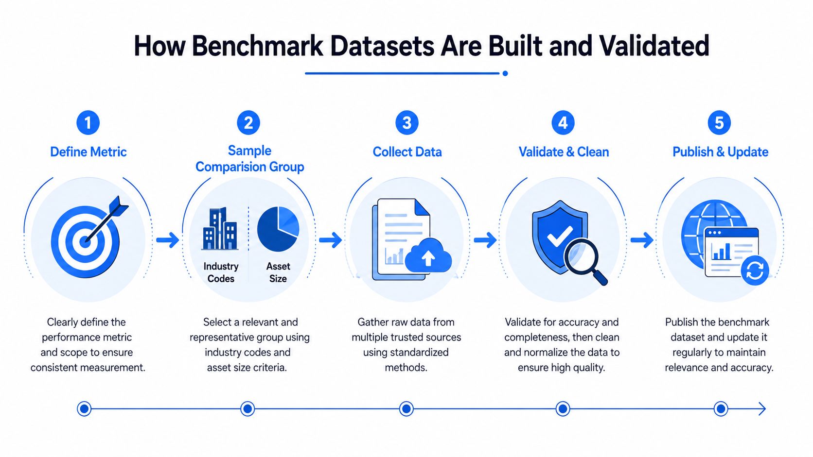
Verification matters as much as collection. BigBench/TPC-style methodology extends a workload with formal rules for implementation, execution, metric calculation, result verification, publication, and pricing, which helps expose real performance differences rather than benchmark artifacts. In plain English, the benchmark needs to be hard to game and easy to reproduce.
If the methodology page is vague, the benchmark probably is too.
Independent benchmark practitioners also point to public databases, trade associations, and government sources, then check freshness and methodological consistency before treating a number as usable. That is the standard worth expecting, whether the benchmark is financial, operational, or digital.
Benchmark Examples Across Four Sectors
Sector benchmarks become useful when they match the actual work on the ground. A real estate team wants to know whether tour traffic turns into appointments. A hotel marketer wants to see whether booking behavior is healthy. An admissions team wants to understand whether digital engagement leads to inquiries. An architecture studio wants to know whether early interest turns into real projects.
| Sector | Core KPI | Typical Benchmark Anchor | Data Source Class |
|---|---|---|---|
| Real estate | Tour bounce and listing-to-tour conversion | Median peer performance for similar listings and markets | Brokerage, platform, and property-market data |
| Hospitality | Booking-engine conversion and dwell behavior | Median performance for comparable properties and booking funnels | Hospitality analytics and financial ratio datasets |
| Education | Inquiry-to-application and virtual event engagement | Median performance for similar institutions and student segments | Institutional analytics and public-sector reporting |
| Architecture | Lead-to-brief conversion and client engagement | Median performance for studios of similar size and client mix | CRM, project pipeline, and professional-services data |
Real estate operators often need a local-market lens, not a broad category average. That's where a guide for analyzing real estate markets can help frame the search for a fair comparison, because property data only makes sense when the geography and asset type line up. A listing with high tour volume but poor follow-through may still be outperforming a tighter submarket, even if it looks weak against a broader category.
Hospitality benchmarking usually needs a cleaner separation between traffic quality and booking efficiency. A booking engine can attract plenty of visits but still underconvert if room type mix, price point, or device behavior differs from peer properties. In that case, a peer median is less about chasing a number and more about noticing where the funnel breaks.
Education teams face a different problem, student interest doesn't always convert on the same timeline as retail traffic. Inquiry spikes can be useful, but they need to be tracked alongside application flow and event participation. Architecture studios and other professional services firms usually care about whether early contact becomes a scoped brief, because that's where revenue becomes real.
The most useful benchmark values are usually ranges, not single points. Seasonal shifts, market size, and customer mix all create dispersion, so a smart operator reads benchmark data as a band of normal behavior, not as a perfect instruction.
Turning Your Virtual Tour Analytics into Benchmarks
A virtual tour dashboard becomes useful only after you decide what “good” should be measured against. Views, unique visitors, device split, geographic distribution, dwell time, lead-form submissions, and tracked conversions tell you what happened, but they do not tell you whether the result was strong for your market, your property type, or your sales process. Without that context, the team is collecting motion, not insight.
Start by defining the comparison group before you set the target. For a virtual tour funnel, that means narrowing by property type, geography, and funnel stage, then deciding whether you are comparing against your own past performance, a peer median, or both. Standardizing how the metric is defined and checked matters here, because a benchmark only helps when everyone is measuring the same thing in the same way.
A workable benchmark sequence
- Set the peer frame. A residential listing should not be judged by the same standard as a campus tour, and a luxury property should not be judged against a mass-market listing.
- Pull a local baseline. A recent baseline from the business's own analytics gives you a live starting point.
- Use one external anchor. A published sector benchmark, if it is comparable, can act as a sanity check rather than a command.
- Measure the gap. Compare the business's number to the peer median or internal baseline and note whether the issue sits in traffic quality, engagement depth, or conversion.
- Set the 90-day action. The target should be tied to a specific lever, such as channel pages, embed tracking, lead forms, or exportable video walkthroughs.
Practical rule: if the comparison group is wrong, the target will be wrong too.
The VirtualTourEasy analytics dashboard helps make this concrete. A high view count with weak dwell time points to a different problem than strong dwell time with few lead-form submissions. The first suggests the tour attracts attention but loses interest early, while the second suggests visitors stay engaged but do not take the next step. If you map those signals to a peer group, you can see whether the issue is reach, engagement, or conversion rather than treating every metric as a single score.
That is also where segment definition becomes practical instead of abstract. A brokerage can separate listings by geography, price band, or property type, then compare each segment with its own baseline. The result is closer to how live reporting for asphalt contractors works in the field, where the value comes from seeing the right work order, crew, or job type side by side instead of averaging everything together.
A small brokerage may need to benchmark itself against a narrower peer set before any comparison becomes useful. If the business model or audience is too different, the right move is to redefine the benchmark group, not force a bad comparison. A tour embedded on a high-intent listing page will not behave like one used for broad awareness, so the target should reflect the role the tour plays in the funnel.
For implementation, the tracking setup matters as much as the target. A clean data path is the difference between a real signal and a broken attribution trail, which is why an internal Google Tag Manager setup guide matters whenever conversions need to be measured consistently.
When Published Benchmarks Are the Wrong Comparison
Published averages can mislead when the local business environment is structurally different from the dataset. A rural clinic, for example, may face different travel distance and provider supply conditions than an urban practice, so a national median can flatten the operating picture. The same issue appears in property, hospitality, and professional services when the peer set ignores geography, scale, or customer mix.
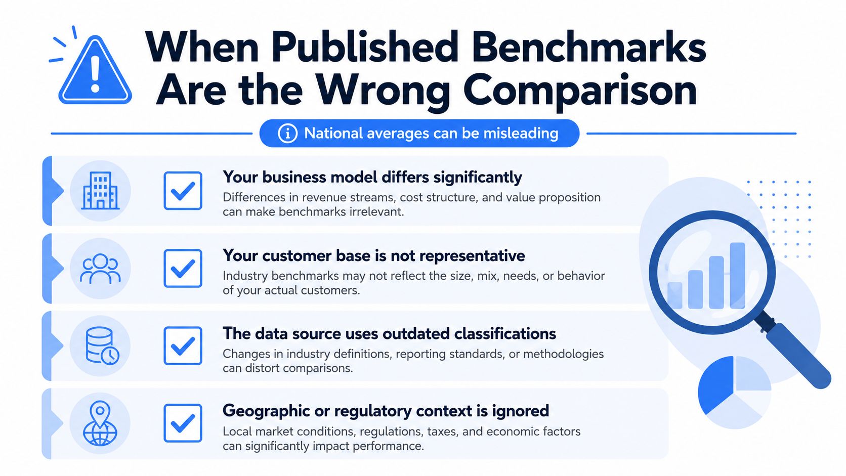
The question to ask is simple, is the published number comparable? If the answer is unclear, the benchmark should be treated as advisory, not authoritative. A boutique hotel is not a flagship resort. An independent brokerage is not a national franchise network. The same logic applies to a school, a clinic, or an architecture studio.
Four checks before trusting a published benchmark
- Business model fit. Does the dataset reflect the same revenue logic and operating model?
- Customer mix match. Are the customers, clients, or patients similar enough to be comparable?
- Freshness. Is the benchmark recent enough to reflect current behavior?
- Segment definition. Are geography, size, and classification aligned with the business being measured?
When the answer to any of those checks is no, the safer option is often an internal benchmark. A business with six to twelve months of consistent own-data history can build a cleaner reference point than a stale external average. That's especially true when the market is local, fragmented, or highly sensitive to seasonality.
National averages can be useful as context, but they're not automatically fair comparisons.
The practical takeaway is not to reject published benchmarks. It's to use them carefully, only when the sample, segment, and operating model are aligned.
Reliable Sources and a Benchmarking Project Checklist
A benchmarking project starts with the source, because a weak source makes every target look more certain than it is. If the comparison set is fuzzy, the result can feel precise while still being misleading. That is a common problem for business owners who are seeing benchmark data for the first time, especially when the numbers come from different systems with different rules.
Reliable benchmark work usually begins with government statistics portals, trade associations, industry classification systems, and paid ratio databases. These sources tend to provide documentation, structure, and a repeatable method for collecting or grouping the numbers. Platform-native analytics can also help, but only when the tracking setup is stable and the measurement rules are clear enough to compare from one period to the next.
The harder task is separating useful comparisons from false ones. Independent guidance on benchmarking points readers toward public databases, trade associations, and government sources, then asks them to check freshness and methodological consistency before treating any figure as a usable reference [source]. That same discipline applies to financial, operational, and digital benchmarks.
A short source check before any benchmark gets quoted
- Freshness: Confirm that the dataset is recent enough for the decision being made.
- Methodology transparency: Look for definitions, sample construction, and calculation rules.
- Sample size and segment match: Make sure the comparison group is large enough and relevant.
- Metric consistency: Check that the same KPI means the same thing across sources.
The next question is whether the comparison group belongs in the same conversation. A hotel benchmark built from national chain data will not help much if the business being measured is a small independent property with local demand patterns. The same problem shows up in digital tracking. If lead sources are tagged differently from one campaign to the next, the benchmark for lead quality becomes hard to trust. A practical lead source tracking guide helps prevent that kind of mismatch by keeping the capture rules consistent before the comparison starts.
A small team does not need a large framework to begin. It needs a clear project template. Define the scope, choose the comparison group, select the metrics, establish a baseline, set a target, assign an owner, and decide how often the benchmark will be reviewed. That may sound plain, but plain is useful here. Complex benchmarking projects often stall because nobody can tell whether the number is supposed to inform a pricing change, a staffing decision, or a marketing adjustment.
A compact benchmarking project template
| Field | What to fill in |
|---|---|
| Scope | Which funnel, market, or business unit is being benchmarked |
| Comparison group | Which peer set or internal history will be used |
| Metrics | The KPI or KPIs being tracked |
| Baseline | The current performance level |
| Target | The performance level the team is trying to reach |
| Owner | Who is responsible for review and follow-up |
| Review cadence | How often the benchmark will be revisited |
| Decision rule | What changes if the business is below, at, or above benchmark |
Virtual Tour Easy shows how this works in practice. A dashboard can track views, leads, and the source of those inquiries, then turn those raw events into a comparison that matters. Raw tour counts by themselves are just activity. Once they are grouped by channel, location, or tour type, they become a peer set. From there, a business can ask a better question, which segment is producing the strongest response, and what should a realistic target look like for that segment?
The final check is simple. What will the team do differently if the number lands below, at, or above benchmark? If the answer is nothing, the benchmark is only a report. It has not become a management tool.
Virtual Tour Easy gives teams a way to create immersive tours, track views and leads, and connect that activity to real performance decisions. For businesses trying to turn raw tour analytics into meaningful benchmarks, it provides the measurement layer that makes comparison possible. Visit Virtual Tour Easy to see how better tour data can support clearer targets and better decisions.