A prospect spends two minutes moving through a 360° tour of a listing. The kitchen sells the home, the primary suite confirms it, and then the contact form opens on a phone. Name, email, phone, budget, timeline, financing status, preferred lender. The visitor stops at field four and leaves.
That failure isn't a traffic problem. In 2024, 74% of businesses used web forms to generate leads, according to Fluent Forms' industry survey as reported in guidance to design lead forms that convert. Forms work when they respect the moment. A tour visitor on mobile has already given attention, but attention isn't the same as readiness to complete an intake questionnaire.
The practices below start with the decisions that affect every visitor, then move to validation, trust, and measurement. They're written for real estate, hospitality, venues, education, and architecture, where the form usually sits inside or beside an immersive tour. Applied in order, these lead generation form best practices turn a form from a filing task into the natural next step after viewing a space.
Table of Contents
- 1. Ask Only for Essential Information
- 2. Use Multi-Step or Progressive Forms
- 3. Design for Mobile First
- 4. Clarify the Value Exchange and Use a Specific CTA
- 5. Implement Inline Validation and Clear Error Messages
- 6. Use Autofill, Smart Defaults, and Autocomplete Attributes
- 7. Add Trust Signals and Privacy Assurances Near the Form
- 8. Track Form Analytics and A/B Test Changes
- How the eight lead form practices compare by focus, best use case, and main trade-off
- Turning Your Tour Form Into a Reliable Lead Source
1. Ask Only for Essential Information
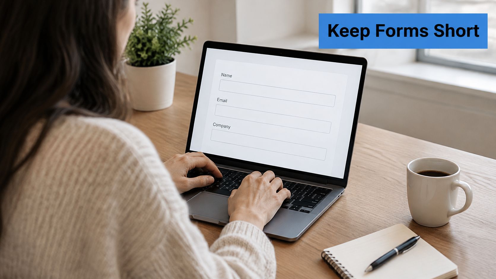
Every field must change the next action. If the answer doesn't affect who responds, how fast, or with what offer, it belongs later. HubSpot's 2020 analysis of 173 valid marketer survey responses found the average web form used approximately 4.92 fields, with five fields the most common configuration. That's a ceiling to test against, not a target.
A brokerage tour page usually needs name, email, and preferred viewing date. Budget, pre-approval, and move timeline matter, but an agent can ask those on the follow-up call once contact exists. A hotel team showing a lobby and suite tour needs email and travel dates to check availability. Guest count history, loyalty number, and full profile details add friction without changing the first reply.
The Field Audit
- Keep first-contact fields: Name, business email, organization, and one context question such as property type or intended use.
- Defer detail: Move budget, timeline, and specifications to a thank-you page, follow-up email, or sales conversation.
- Use progressive profiling: Returning visitors shouldn't answer the same questions twice.
A structured approach to real estate lead qualification helps decide which single qualifying question earns its place. Start with the minimum set, then test adding one field at a time while watching qualified-lead rate, not submissions alone.
2. Use Multi-Step or Progressive Forms
One benchmark summarized from Digital Applied data in IvyForms' lead generation guide reports conversion falling from 23.1% with three fields to 6.9% with ten or more fields. Length itself isn't the only problem, though. A wall of fields shown all at once looks like work. The same questions, split into short steps, feel manageable.
Say a venue needs event type, date, guest count, layout preference, name, email, and phone. On one screen, that's a chore on a phone. Split it and step one asks only event type and date, step two asks guest count, and step three collects contact details. Each tap creates momentum, and the visitor has already invested effort before reaching personal information.
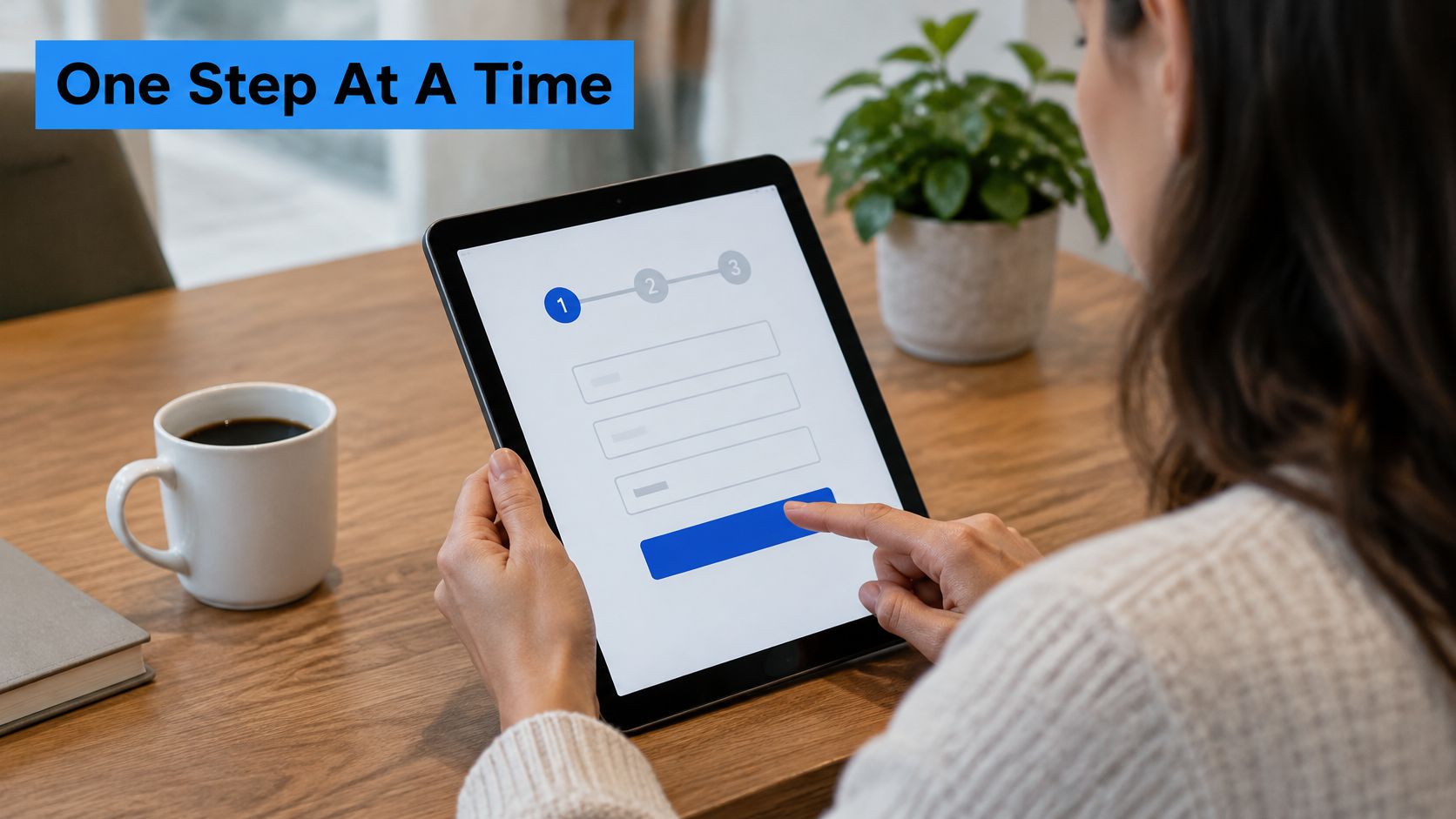
A university admissions inquiry works the same way. Program of interest and student status come first and can branch the remaining questions. Contact details come last, once the visitor sees the form is relevant to a specific program. Typeform's analysis of 10,000 lead-capture forms found that in 2025, forms with 10 questions had completion rates 28% lower than forms with 3 questions, which is another reason to sequence rather than stack.
Practical rule: Keep each step to one purpose and two or three related fields, show a progress count, and label the button Continue, not Submit.
Save step one automatically where the platform allows it. A partial record with a use case is more useful than a clean abandonment, provided consent language is clear.
3. Design for Mobile First
Tour links get opened from text messages, listing alerts, Instagram, and QR codes at open houses. The phone isn't the secondary device. It's often the only one, and field count hits harder there. A benchmark cited in Reform's mobile form design research reports a 5-field B2B form converting at 8.7% on mobile versus 12.8% on desktop.
That's why blended conversion rates mislead. A form can look acceptable overall while failing badly on mobile. Agents, event planners, and architects reviewing a tour between appointments won't pinch, zoom, and fight a two-column layout. They'll close the tab.
Mobile Non-Negotiables
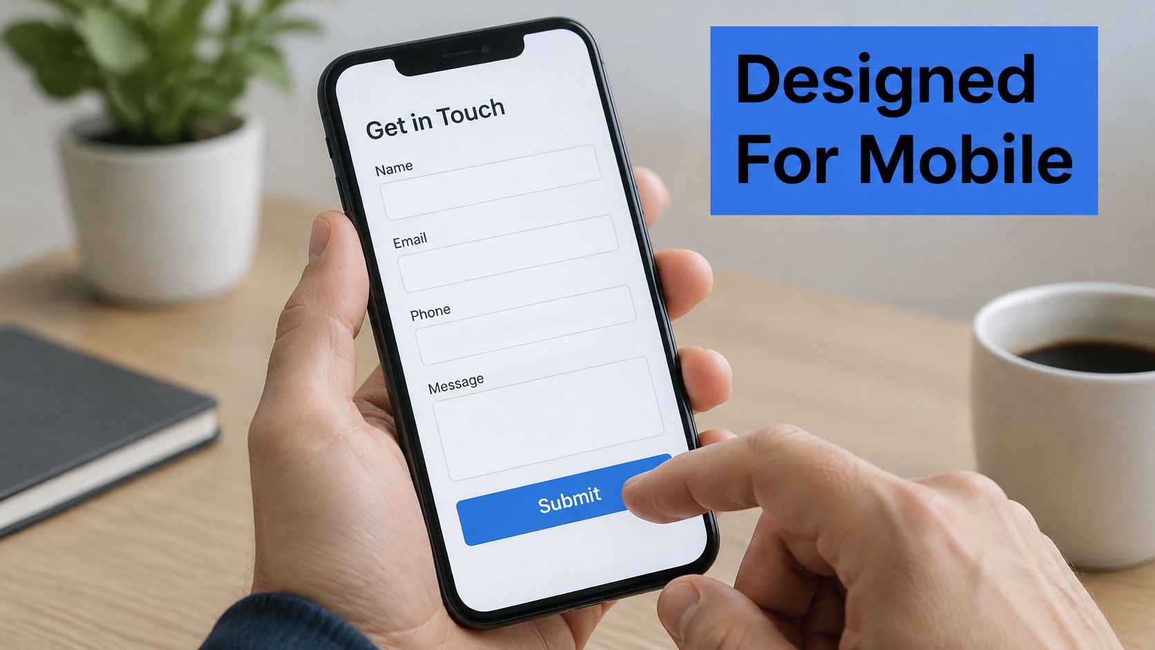
- Single column: Stack fields vertically with labels above inputs and no horizontal scrolling.
- Correct keyboards: Use type=email, type=tel, and inputmode attributes so the right keyboard appears.
- Constrained choices: Use radio buttons or dropdowns for property type, event size, or program instead of free text.
- Full-width button: Keep the submit button large, tappable, and visible without zooming.
A restaurant reservation form beside a 360° dining room tour should use a date picker and numeric phone keyboard. A hotel inquiry can open as a bottom sheet inside the tour rather than sending the visitor to a separate page. Digital Skyrocket's lead generation design guide covers broader layout choices, but the test that matters is simple. Complete the form one-handed on an iPhone and an Android phone before launch.
4. Clarify the Value Exchange and Use a Specific CTA
Visitors don't submit forms to help a sales team. They submit when the return is obvious. Submit and Contact Us name no return at all. Schedule an In-Person Showing, Get the Floor Plan, and Send Me Pricing name exactly what arrives after the tap.
Nielsen Norman Group's B2B website research examined 293 business websites across the United States, United Kingdom, and Singapore. Its guidance treats the form as part of an end-to-end journey where the page explains the value offered before asking for information. For tour pages, that value should match what the visitor just viewed.

An architecture firm can offer Download the Full Project Portfolio with a note that the PDF arrives instantly by email. A school can offer Book a Campus Visit after the virtual campus tour. Both beats a generic request for contact details because the exchange is concrete and immediate.
The button should complete the visitor's sentence. A person thinks "Send me the pricing for this venue," not "Submit my data."
Write the CTA as verb plus outcome. Add one line under the button stating what happens next and the expected response time. Test headline and CTA copy before testing colors or layout, because wording usually carries the larger effect. Early-stage tour viewers also need a lower-commitment option, such as Send Me the Brochure, alongside the high-intent Book My Tour.
5. Implement Inline Validation and Clear Error Messages
Nothing kills a nearly finished form faster than pressing submit, watching the page reload, and finding three red fields with no explanation. Inline validation catches problems as each field is completed. The visitor fixes one small thing in the moment instead of hunting for errors after the fact.
Validation should trigger on blur, when the visitor leaves a field, not on every keystroke. Flagging an email as invalid while someone is still typing the domain creates noise. Once the field loses focus, a specific message helps. Enter an email like name@company.com beats Invalid input every time.
Writing Errors That Get Fixed
- Name the fix: "Add the area code" tells a phone-field visitor exactly what's missing.
- Confirm success subtly: A small check beside a valid email reassures without interrupting.
- Preserve entered values: Never clear completed fields after a failed submission.
- Announce errors accessibly: Use aria-describedby and aria-live regions so screen reader users hear what changed.
Say a school inquiry form requires graduation year. The error should appear beside that field, in plain language, while the visitor's name and email stay intact. Accept common phone and date format variations too. A form that rejects (555) 123-4567 because it expects dashes only is punishing correct information. Flexible parsing costs little and saves leads that rigid validation throws away.
6. Use Autofill, Smart Defaults, and Autocomplete Attributes
Typing is the slowest part of any form, especially one-handed on a phone after exploring a 360° tour. Browsers and password managers already store name, email, phone, and organization. Correct autocomplete attributes let them do the typing. Without those attributes, autofill guesses, and it often guesses wrong.
Add autocomplete="name", autocomplete="email", autocomplete="tel", and autocomplete="organization" to every standard field. The implementation takes minutes. The payoff shows up on every single submission, because a returning visitor can complete contact fields with one tap instead of twelve.
Defaults That Help Instead of Trap
Smart defaults reduce decisions. A venue inquiry form can default the event date to the next available weekend. A hotel form can pre-select the property the visitor just toured instead of asking them to find it in a list. A university form can carry the program page's program into the inquiry automatically.
Defaults must stay visible and changeable. A pre-filled value the visitor can't see or edit creates bad data that looks clean. Sensitive fields shouldn't be pre-filled without consent, and stored data practices must comply with local privacy regulations.
Check before launch: Test autofill in Chrome, Safari, and Firefox. Each browser matches attributes slightly differently, and a form that autofills perfectly in one can scramble fields in another.
Returning visitors deserve the biggest shortcut. Pre-fill name and email from a previous session where consent allows, then ask only the new question for this tour or property. Less typing means faster submissions, and faster submissions mean fewer chances to abandon.
7. Add Trust Signals and Privacy Assurances Near the Form
A phone number request triggers a simple question. What happens to this information, and who calls? Forms that don't answer that question lose cautious visitors, and cautious visitors include plenty of serious buyers. A 2025 WebAIM Million summary cited in WPDean's web accessibility statistics compilation reported detectable WCAG failures on 94.8% of analyzed home pages, a reminder that trust and usability problems often sit in plain sight.
Trust signals work when they're specific. A named testimonial from a recent buyer beside a listing tour form beats a row of anonymous stars. A hotel package page can show its review score and one plain line stating inquiries are answered within one business day. Generic security badges nobody recognizes add clutter, not confidence.
Placement That Reduces Hesitation
- Privacy note under the button: State plainly that details aren't shared with third parties.
- Reason per sensitive field: "Phone is only used to confirm your showing time" justifies the ask.
- Response expectation: Name who replies and how quickly.
Reading client feedback on B2B outbound shows how attributed proof differs from vague praise, and the same principle applies beside a form. For tours collecting personal data, clear user consent management keeps that trust defensible. Data collected through a customer's lead capture forms belongs to that customer, who acts as data controller for tour viewers' personal data. State that responsibility clearly rather than hiding it in policy text.
8. Track Form Analytics and A/B Test Changes
Opinion-based form design produces endless arguments and flat results. Measurement ends them. Track form_view, form_start, form_step, form_error, and form_submit events in GA4 through a tag manager, then look at drop-off by field and by device. The field with the greatest drop-off is the next test, not the field someone dislikes aesthetically.
Say a real estate team finds the phone field has the highest abandonment on mobile. The test writes itself. Make phone optional for half of visitors and compare completion rate. Then compare what matters, the booked showing rate for each group. A version with more submissions but fewer showings isn't better.
That downstream view is the gap in most form advice. OwlClaw's lead generation benchmarks argue for judging forms by qualified-lead rate, sales acceptance, and opportunity value rather than conversion rate alone. Tours attract students, travelers, renters, and casual viewers alongside buyers, so raw volume can inflate reports while overwhelming a sales team.
Running Tests That Prove Something
- One primary metric: Define it before the test starts, such as completed submissions per visitor.
- Enough duration: Run until results reach statistical significance. Don't stop early on a good day.
- Separate segments: Compare mobile and desktop, plus traffic source, independently.
A university admissions office testing a two-step form should measure qualified application rate, not just inquiries. A solid conversion tracking setup connects form versions to those outcomes. GA4, GTM, and custom scripts can be added to published Virtual Tour Easy tours on the Business plan, which makes scene-level form tracking practical.
How the eight lead form practices compare by focus, best use case, and main trade-off
| Item | Best For | Core Focus | Main Trade-off |
|---|---|---|---|
| Ask Only for Essential Information | Real estate agents, hospitality marketers, and teams collecting inquiries from tour pages | Collect only the details needed for follow-up | Fewer fields can limit lead qualification and segmentation |
| Use Multi-Step or Progressive Forms | Architecture studios, schools, universities, and event venues collecting detailed inquiries | Split longer forms into manageable steps | Extra steps can frustrate visitors if progress and questions are unclear |
| Design for Mobile First | Businesses whose audiences browse tours or listings on phones, especially real estate and hospitality | Make fields and buttons easy to read, tap, and complete | Requires testing on different screen sizes and adapting the desktop layout |
| Clarify the Value Exchange and Use a Specific CTA | Hospitality marketers, event venues, and real estate teams seeking tour requests | State what visitors will receive and use a clear action button | Promises that do not match the follow-up can weaken trust |
| Implement Inline Validation and Clear Error Messages | Forms collecting multiple details, such as phone numbers or addresses | Show visitors how to fix an error as they complete the form | Strict or intrusive validation can reject valid entries or interrupt completion |
| Use Autofill, Smart Defaults, and Autocomplete Attributes | Schools, hotels, and organizations with repeat visitors or frequent inquiries | Reduce typing while keeping prefilled details editable | Autofill can be inaccurate, and unexpected defaults can raise privacy concerns |
| Add Trust Signals and Privacy Assurances Near the Form | Real estate, architecture, and hospitality brands collecting contact or project details | Explain how inquiries are handled and add relevant proof | Unsupported claims or too many trust cues can reduce credibility and crowd the form |
| Track Form Analytics and A/B Test Changes | Teams running campaigns or drawing substantial traffic to tour pages | Measure form behavior and compare changes against defined outcomes | Tracking needs sufficient traffic and privacy-aware implementation |
Turning Your Tour Form Into a Reliable Lead Source
Start with the two changes that touch the most visitors. Cut every field that doesn't change the next action, and make the surviving form work properly on a phone. Those fixes alone address the largest share of abandonment, because they remove the friction every visitor meets, on the device most tour links are opened on.
Then work down the list in order. Split anything longer than a short form into steps with a progress count. Rewrite the headline and button so the value exchange is unmistakable, something as specific as Book My Tour or Send Me Pricing. Add inline validation that preserves entries and explains fixes in plain language. Attach autocomplete attributes and sensible defaults so returning visitors barely type.
Trust and measurement come next, and neither is decoration. A privacy line under the button, a named testimonial, and a stated response time answer the hesitation that stops cautious buyers. Field-level analytics then show which remaining problem costs the most leads, so the next test targets evidence instead of opinion.
Keep the cadence modest and consistent. One measured test per month, judged by qualified leads and booked appointments, compounds faster than a yearly redesign. Each small fix raises the yield from every tour already published, without buying more traffic.
The tour already does the persuasive work. It lets a buyer stand in the kitchen, a planner judge the ballroom, and a student walk the campus from another state. The form's only job is to catch that interest before it cools. Short, mobile-first, specific, and measured. That's the whole formula, and it holds across listings, hotels, venues, campuses, and design portfolios alike.
Virtual Tour Easy supports this approach directly, since its lead generation captures contact requests inside tours, including name, email, phone, and message, and delivers them to the business. Lead capture forms are available on the Solo, Professional, and Business plans. Placing a short form at the moment a viewer finishes a key scene keeps the ask small and the intent high.
Virtual Tour Easy lets businesses build immersive 360° tours and capture contact requests inside the viewing experience, so interest turns into an actionable lead instead of a closed tab. Pair a short, mobile-first form with a tour of a listing, venue, campus, or project, and every published scene becomes a working entry point for qualified inquiries. Visit Virtual Tour Easy to create a tour and put these form practices to work.